
Ballard Power Systems
ESG reporting: Double-edged sustainability
Ballard Power Systems is the world leader in hydrogen fuel cell technology, offering zero-emission solutions that transform commercial transport, including public transit, rail, freight, and marine. They are also aiming for carbon neutrality in manufacturing. We helped Ballard create their sustainability report, which fully reflects the wide spectrum of their activities.
Nicolas Pocard
Vice President Marketing & Strategic Partnerships - Ballard Power Systems
ESG report rooted in the wider brand narrative
Ballard is on a journey towards sustainability, and we had to communicate this philosophy to its community. We utilized images of movement and transportation to embody this journey. This approach allowed us to link the content of the ESG report with the broader narrative of the company’s success.
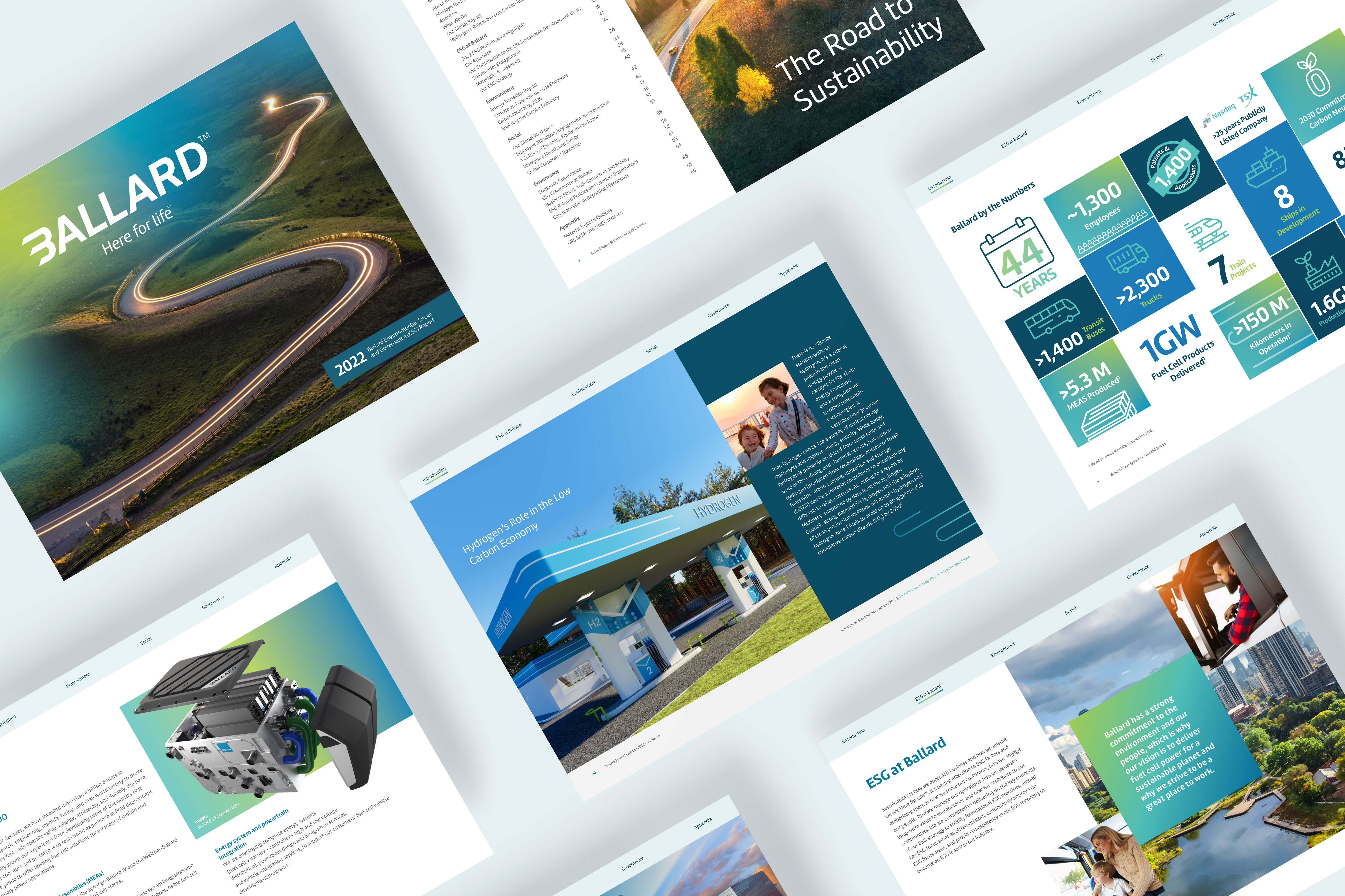
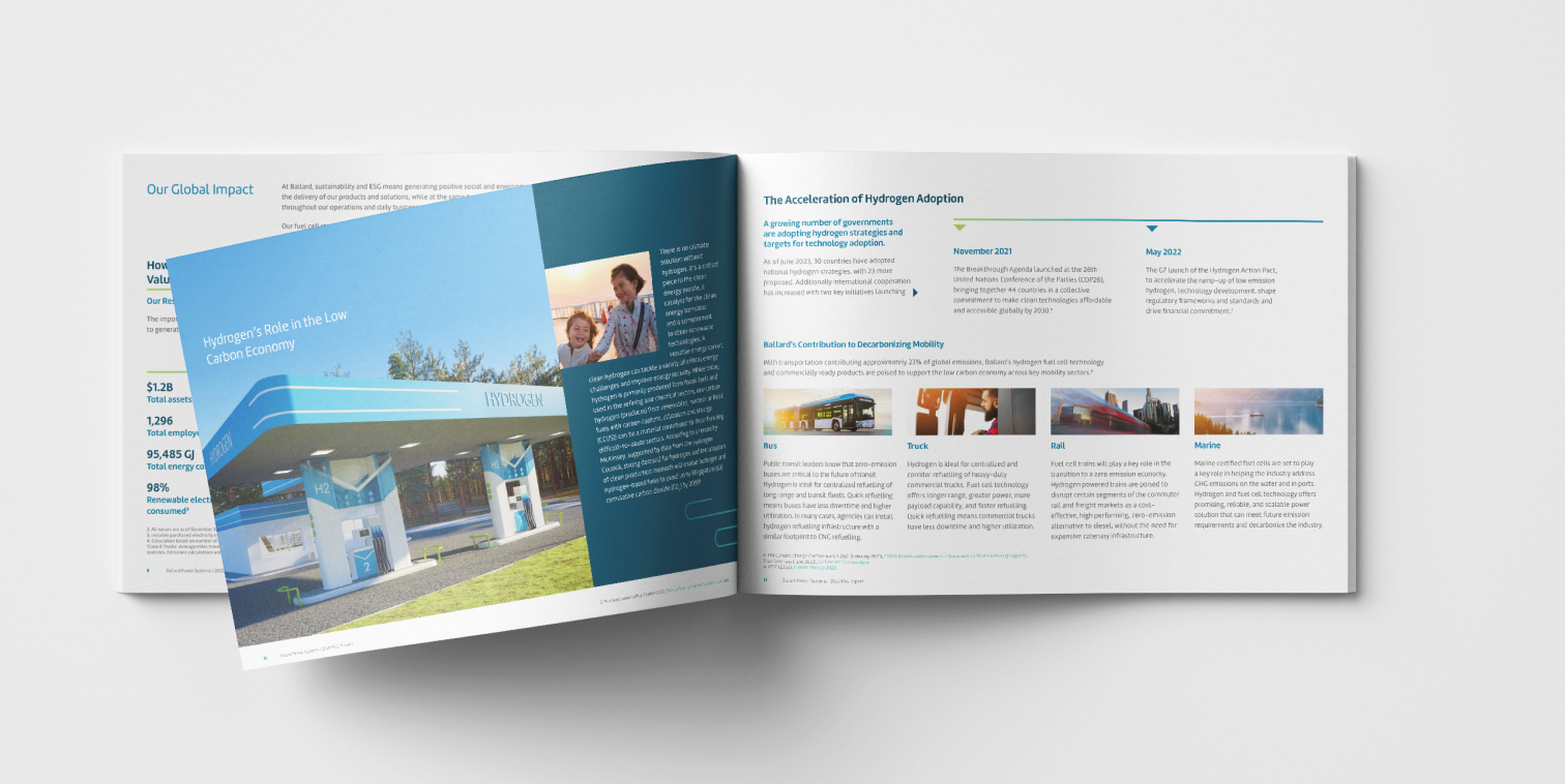
Infographics helped to tell the story
Ballard’s ESG report was designed for easy reading and flow. To enhance its readability and impact, we incorporated visually appealing infographics and colourful tables. We also embedded a hyperlink navigation system within the PDF, allowing readers to easily transition between sections.

Simplified complex data for improved readability
Ballard collected ESG-related data across its enterprise and had a robust system for real-time analysis. Our objective was to accurately represent and simplify the data so that report readers could better understand it.