Optima Living
Evolving a Trusted Name in Senior Living
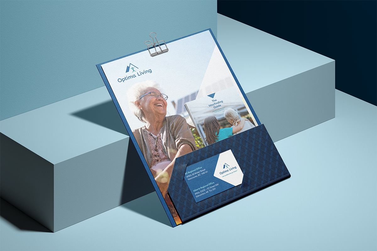
Optima Living is the largest operator of senior living communities in Western Canada, with 38 residences and a strong reputation for care. Following a decade of rapid growth, the leadership team wanted to review their existing visual identity to make sure it kept pace with their evolving brand—and make the necessary changes to make sure it reflected who they are today.
Developing a strategy through research
To ground the brand refresh in insight, we began with a competitive audit. We analyzed the brand identities, messaging, and social media presence of 15 leading senior living organizations across Canada. We then turned that lens inward—assessing Optima’s current brand to uncover what was working and what could be refined.
The result was a clear, actionable brand strategy that positioned Optima as both a caring presence and a professional authority, uniquely rooted in their value proposition: creating welcoming communities that feel like home.
Designing with flexibility and purpose
With strategy and brand personality in hand—friendly, warm, welcoming, knowledgeable, caring, and professional—we moved into design. We explored multiple identity concepts, including logos and graphic systems that would deliver clarity and flexibility across platforms.
At Red Rocket, collaboration is key. We only present creative options we believe in—ones that speak to the target audience and meet strategic goals—but we invite clients into the process to shape a solution they truly connect with.


Honouring the past, updating for the future
Through our conversations, it became clear that Optima’s team had a strong emotional connection to their original icon. Rather than replace it, we evolved it—introducing a clean, custom wordmark with a friendlier, more modern typeface that elevated the legacy icon and brought the brand into a new era.
This new wordmark became the foundation for a broader visual system that now spans print, digital, signage, and more—offering cohesion across every touchpoint.


Creating a unified brand family
Another key challenge was organizing Optima’s growing portfolio of internal initiatives—programs that needed distinct identities while still feeling connected to the parent brand. Their tagline, “Let us welcome you home,” served as both a creative and emotional guide. They refer to it as their “North Star”.
To connect with this idea, we introduced a unifying visual element—a soft star shape—into each sub-brand. This “guiding star” became a golden thread, tying the entire brand ecosystem together with warmth and meaning.
A brand built for connection and growth
Beyond visual consistency, the rebrand had a powerful internal impact. Team members now have a clearer understanding of who Optima is, what they stand for, and how to represent the brand with confidence. The updated brand standards manual we developed has empowered staff across departments to use the identity correctly and creatively—building pride, unity, and clarity at every level. The result is an identity that reflects their mission, resonates with their audience, and is built to grow—just like the communities they serve.