

Mac & Mac Hydrodemolition Services
Positioning a 50-year industrial brand for future growth
Mac & Mac Hydrodemolition Services is a third-generation specialized industrial and infrastructure contractor operating across North America. Utilizing ultra-high-pressure water technology, the company performs critical-path hydrodemolition, industrial cleaning, coating removal, and vacuum services in high-risk environments, including bridges, tunnels, dams, refineries, pipelines, nuclear facilities, and marine infrastructure. Holding over 50 international patents and fabricating much of its own proprietary equipment, Mac & Mac has built a five-decade reputation for unmatched speed, safety, and technical ingenuity as the business expanded across four specialized divisions:
- Hydrodemolition Services, which they refer to as National Infrastructure™,
- Tank Services (Like oil refinery holding tanks)
- Industrial
- Specialized Marine Services, which is named: Maverick
The legacy brand no longer reflected the Company’s true scale, engineering authority, or market leadership. The brand had become fragmented across its several divisions.
Mac & Mac partnered with Red Rocket Creative to develop a cohesive brand strategy and refreshed the visual identity to strengthen its command authority with tier-one industrial clients, engineering firms, and infrastructure asset owners.
Unifying brand architecture through strategy
Prior to initiating design work, we analyzed and structured the corporate organization to build a scalable brand architecture that can accommodate additional divisional brands in the future, if needed. With the company using National Infrastructure™ as its primary market-facing trademark alongside its divisional offerings, the brand architecture required absolute clarity. We applied a streamlined brand model to define how the parent brand interacts with its specialized divisions: Hydrodemolition Services, Tank Services, Industrial, and Maverick Marine Services.
Modernizing legacy brand equity
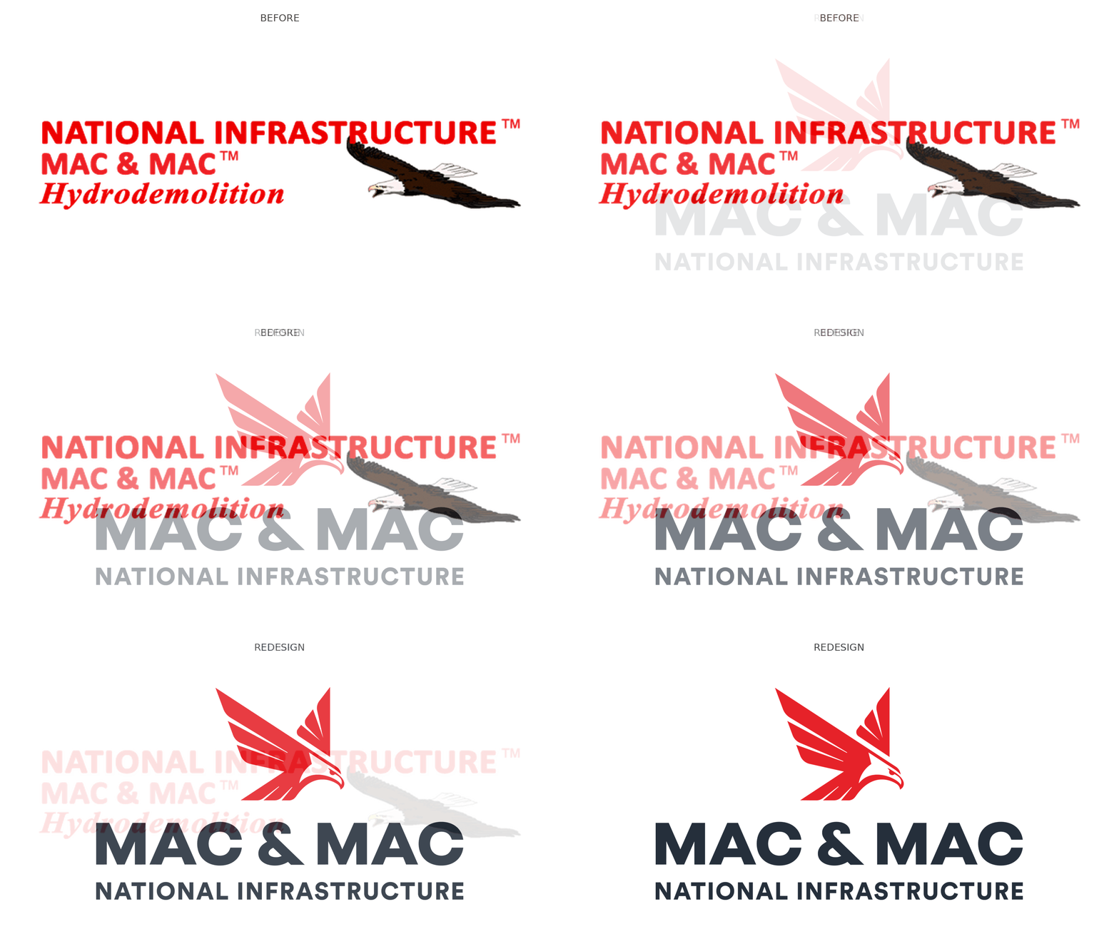
The core visual challenge was modernizing the identity while preserving key heritage brand equity, specifically Mac & Mac’s signature eagle symbolism, the iconic “&” ampersand, and its core colour palette.
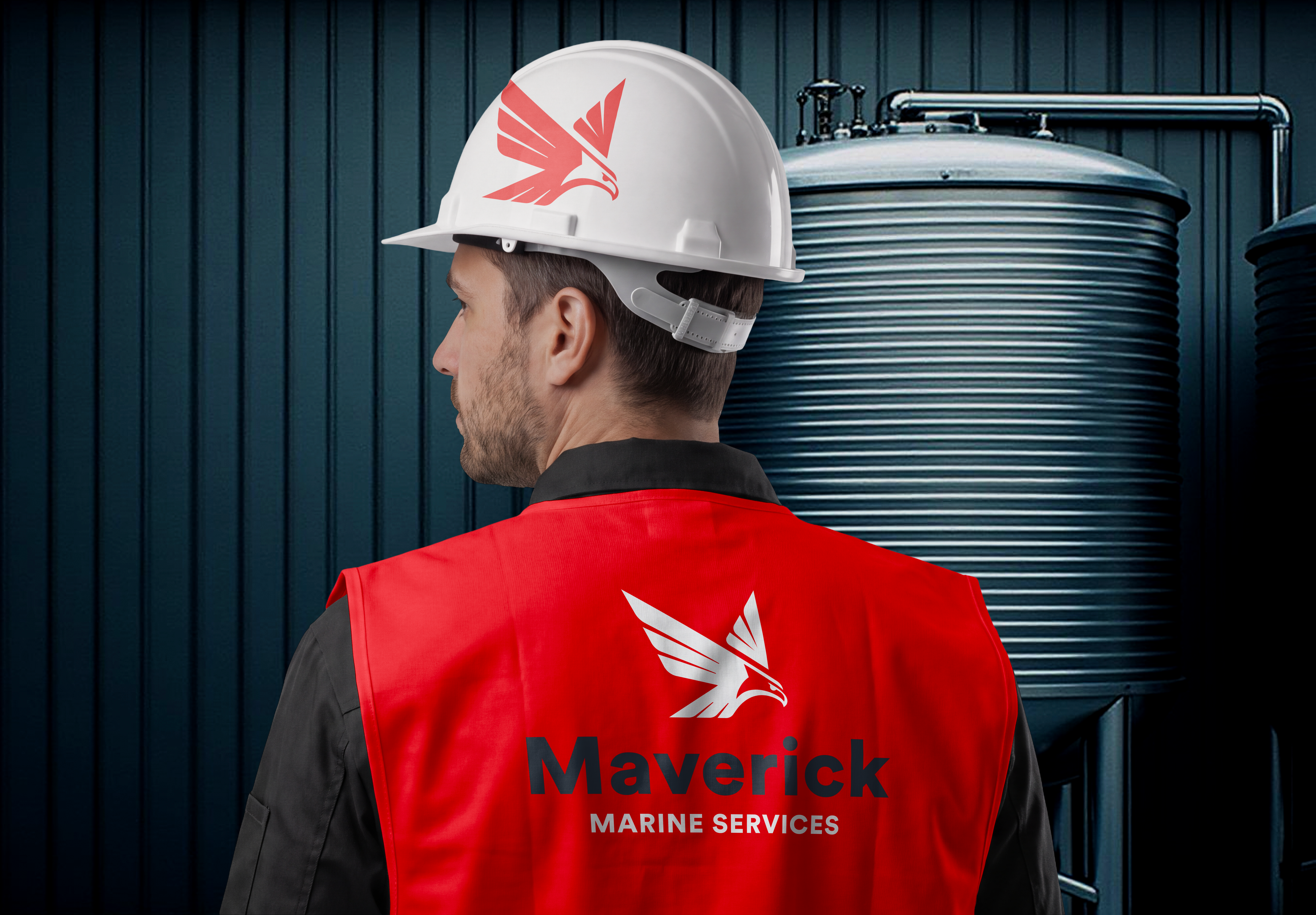
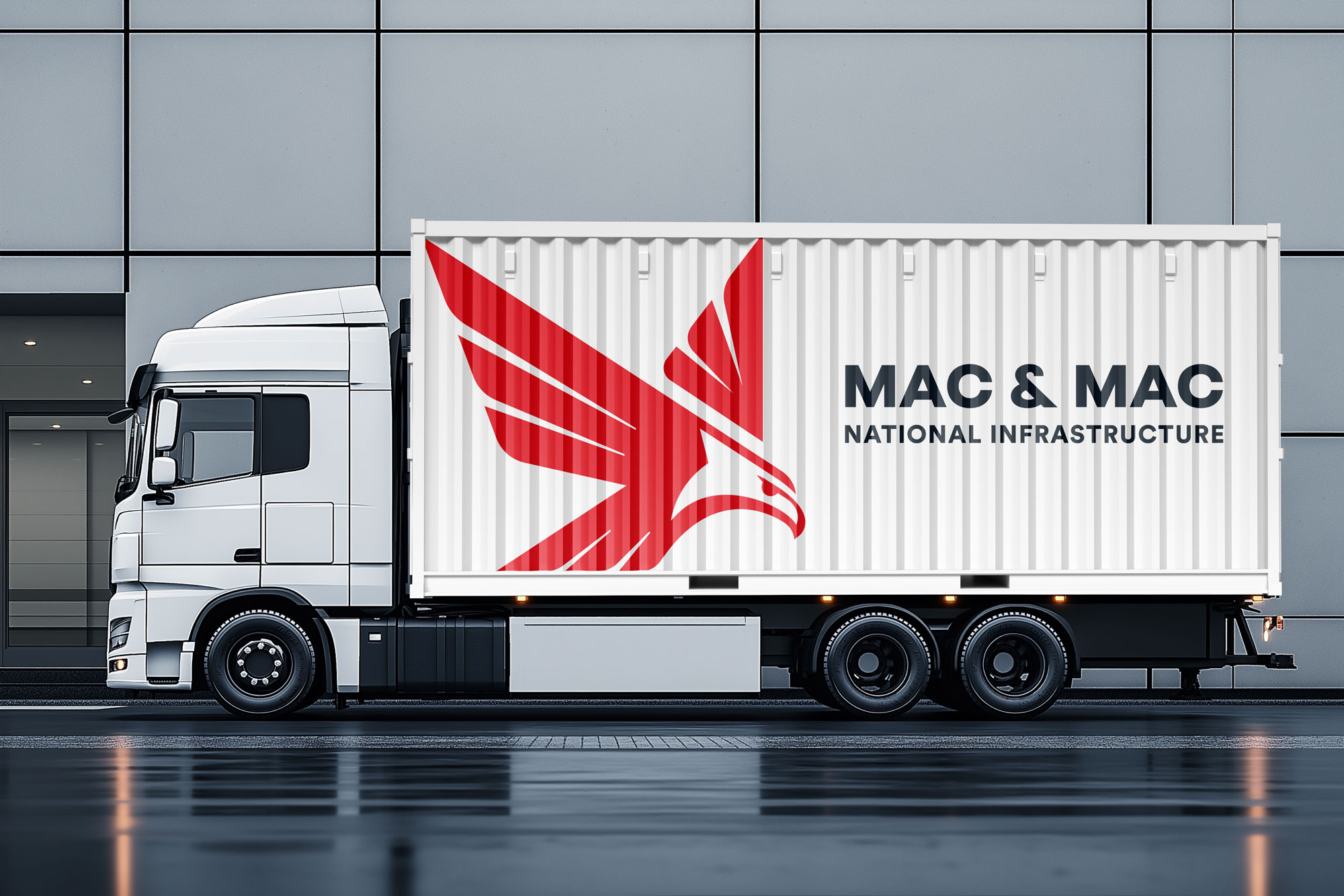
Red Rocket Creative designed a bold, modern logo system that translates strength, certainty, and mechanical precision. The eagle emblem was completely re-imagined into a sharp, geometric mark that signals forward momentum and high-tech capability. We paired the mark with clean, bold typography and carefully preserved the ampersand as a central anchor, creating a flexible logo mark built to perform across heavy field equipment, PPE, digital platforms, and corporate signage.
Driving brand consistency across high-risk environments
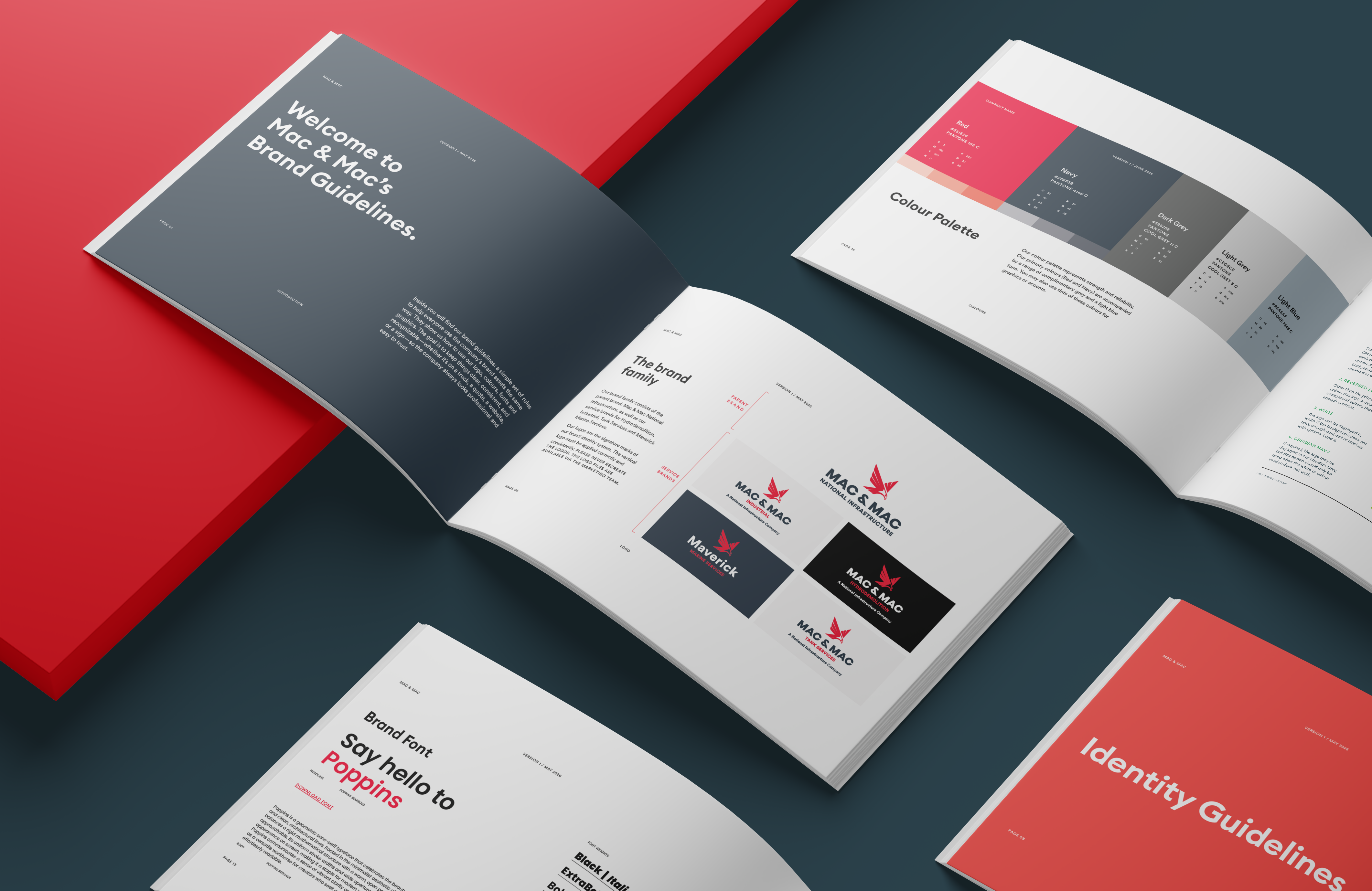
To ensure seamless execution as the brand scales across North America, Red Rocket Creative developed a comprehensive Graphic Standards Manual. The guide outlines precise rules for primary and secondary logo configurations, horizontal and vertical lockups, divisional co-branding rules, and strict clearance zones.
We expanded the classic red, black, grey, and white palette into a high-contrast industrial identity system. Paired with clear typographic guidelines, the brand rules ensure that every touchpoint—from digital pitch decks to safety gear and field vehicles—instills absolute confidence in procurement specialists and tier-one corporate clients.