
Wheaton Precious Metals
Designing an annual report that celebrates two decades of success
When Wheaton Precious Metals, the global leader of finance for the mining industry with a $40B market cap, reached its 20-year milestone, it needed more than just another annual report. It needed a document to celebrate its success while maintaining the professional standards expected of a market leader. RRC was chosen to deliver this celebratory project.
Who says that Annual Financial Reports need to be dull?
Creating impact from cover to cover
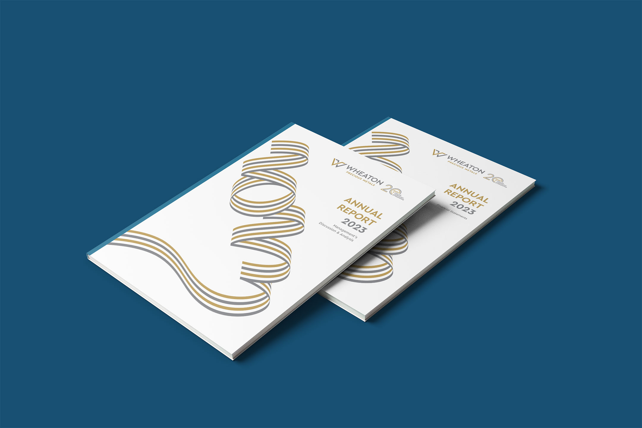
First impressions start with the cover, and RRC created a striking visual statement that immediately communicates Wheaton’s industry leadership and 20-year milestone. The cover design, featuring sophisticated metallic ribbons, sets the tone for the entire report while reflecting the company’s precious metals focus. You can see our innovative approach to information design transformed complex financial data into accessible, engaging content. We developed custom infographics and data visualization systems that clarify intricate financial concepts.
Bringing the CEO's vision to life
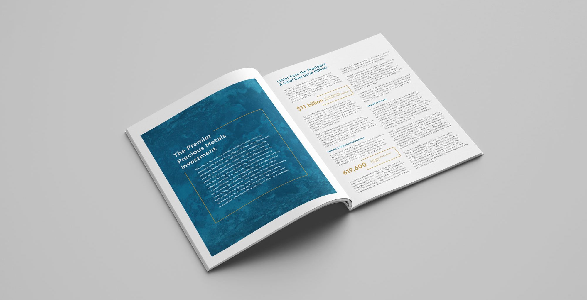
The CEO’s letter is the cornerstone of any annual report, and RRC’s expertise transformed this crucial section into a strategic masterpiece. Through thoughtful typography, clear section headings, and strategic callouts, we crafted a narrative that positions Wheaton as an industry thought leader. The letter serves two purposes: reviewing annual performance and mapping future direction. Our design integrates key performance indicators and pull quotes that reinforce Wheaton’s market leadership, ensuring this section captures and maintains reader attention while delivering critical information.
Making first impressions count
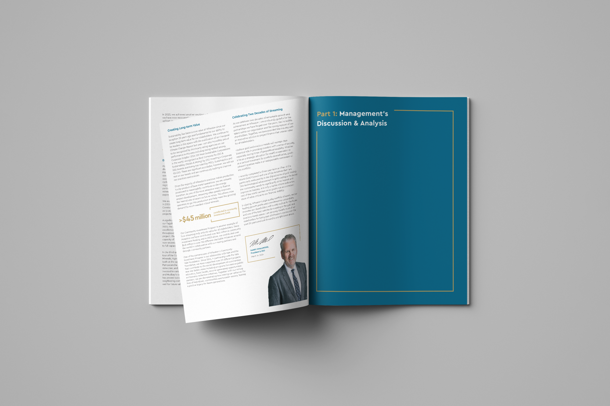
RRC’s expertise shines through our carefully crafted opening sequence. The inside front cover presents our “integrity statement”—a powerful encapsulation of Wheaton’s core values and operating philosophy. This leads to a meticulously designed four-page introduction that delivers essential company information, performance metrics, and strategic direction. Our sophisticated visual system guides readers through complex data while maintaining professional standards, proving that financial reporting can be both compliant and compelling.
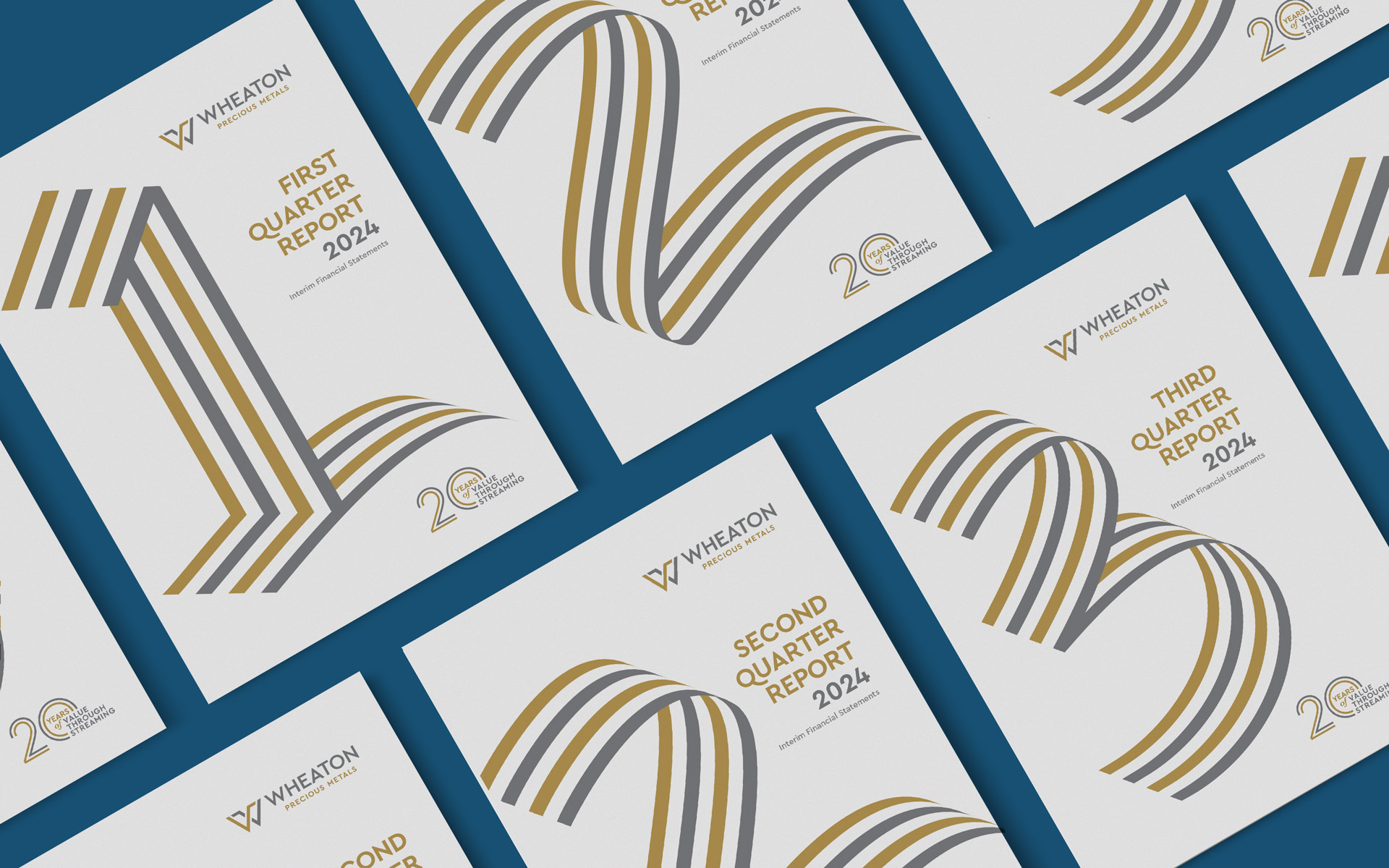
Extending the look to quarterly reporting
Consistency builds brands.
The quarterly reports are yet another opportunity to present your brand to your stakeholders. We kept the messaging and design style for the quarterlies consistent to remind shareholders of WPM’s strength and longevity.